Codux Help Center
Browse our articles to find the answers you need
Adding Your Own Component Library to Codux
In this article, you'll see how to create, publish, and reuse your own component library in projects. When finished, you'll easily be able to consume your library in Codux projects visually through the Add Elements panel.
Getting Started
To create a component library that you can visually consume in other Codux projects, you need the following:
- A Codux project where you can create boards to represent the different states and variations of your components to later consume.
- An NPM account and scope name that you can use to publish your package (i.e., @mycompany/my-components).
To create a component library for Codux and then consume it in other projects, you'll need to:
- Create boards and cover images for each component, and add tags to help identify them.
- Install Codux Librarian (a CLI tool we created for packaging your boards into a format that can be consumed in other projects through the Add Elements panel), configure it, and use it to build the project.
- Publish the project to NPM.
- Consume the library in any project (including the one used to build it!) by adding it as a dependency and to the Codux Add Elements panel.
Step 1: Create Boards and Cover Images for Each Component
To create your own component library, create a board for each component variant, and customize its appearance through its properties and rendering configurations. Once you've settled on how the components in your library should look, and what variations you would like to use (e.g. primary button and secondary button), you can proceed to the next step.
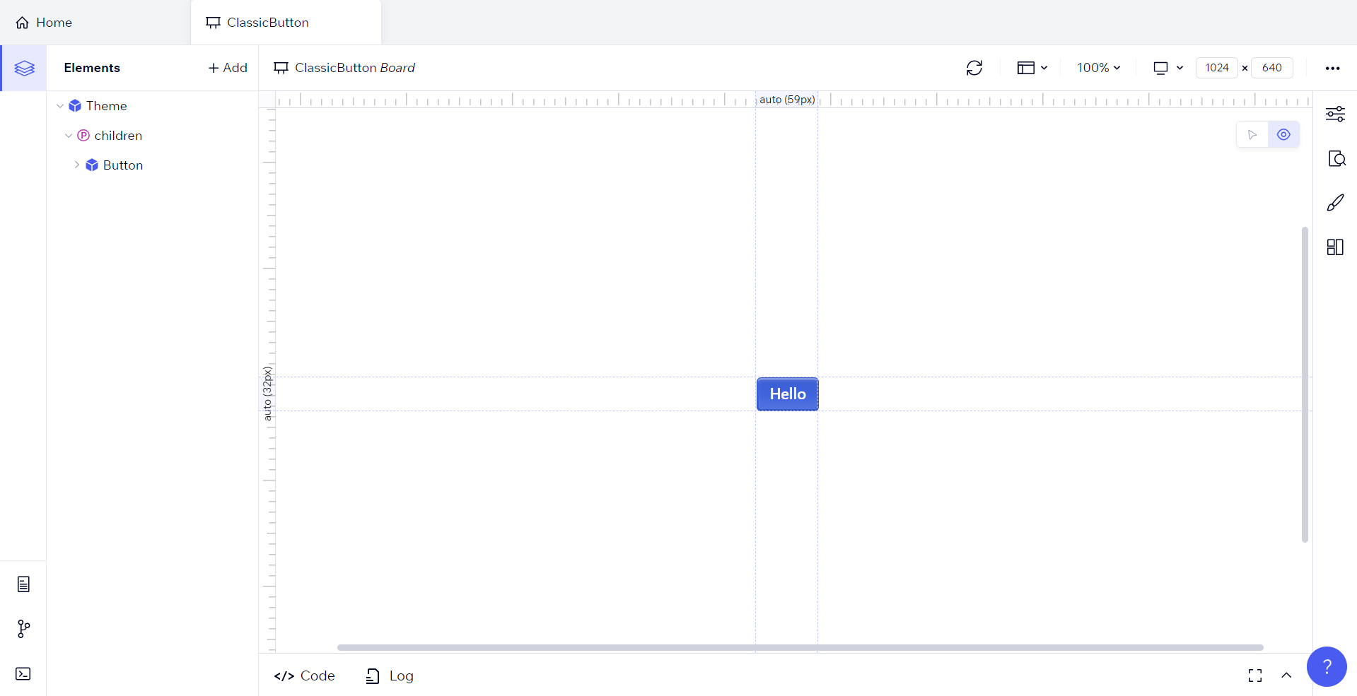
Here's an example where we added a button component from the Radix UI component library to a board for our new library. To use your own library, you'll have to install the relevant dependencies and exchange the imports below for the relevant ones.
// radix-classic-button.board.tsx
1 2 3 4 5 6 7 8 9 10import { createBoard } from '@wixc3/react-board'; import '@radix-ui/themes/styles.css'; import { Theme, Button } from '@radix-ui/themes'; export default createBoard({ name: 'ClassicButton', Board: () => <Theme><Button variant='classic'>Hello</Button></Theme>, isSnippet: false, tags: ["Classic Button", "Blue Button"] });
Tip!
To make it easier to find your components in the Add Elements panel and on the Codux home screen, add tags to them like in the example above. This way, they will show up in a search in the Add Elements panel based on the tag. You can also add tags visually through the Board Settings panel.
The resulting render of this board file looks like this:
Now that we have a board file with our component mocked just how we want it for our boards library, we'll create a cover image for it (below).
Important!
At present, we do not support boards that utilize relative paths for component imports. Please ensure all imports within a board file originate from an external package.
Important!
Boards with multiple return statements are currently incompatible with the Add Elements panel.
Important!
Similar to above, we don't currently support the inclusion of CSS files in boards. This means that layouts written in a CSS file and imported to the board cannot be used when consuming the library.
Note:
To effectively view and design components in boards, it's crucial to install all necessary dependencies in your project. Consider configuring project scripts for easier re-execution of these commands within Codux.
Create a Cover Image for the Board
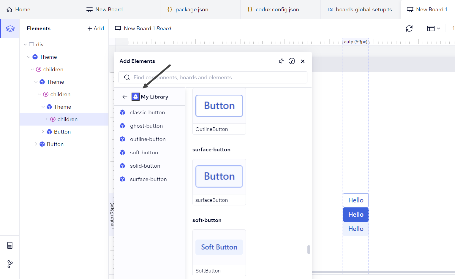
To preview your project's board within a consuming library, a cover image must be created for it. As seen in this screenshot of a component library that we made available to you, the appearance of each component variant in the Add Elements panel is made possible by these cover images.
If you don't create one, you can still use the board, but a generic icon will represent each board in the Add Elements panel instead of an actual preview.
For information on creating cover images, refer here.
Continuing the board file example from above, we'll add in the import statement for the cover image just taken, and reference it using the
cover property of createBoard.1 2 3 4 5 6 7 8 9 10 11 12// radix-classic-button.board.tsx import { createBoard } from '@wixc3/react-board'; import '@radix-ui/themes/styles.css'; import { Theme, Button } from '@radix-ui/themes'; import classicCover from '../../../_codux/covers/classicCover.png' export default createBoard({ name: 'ClassicButton', Board: () => <Theme><Button variant='classic'>Hello</Button></Theme>, isSnippet: false, tags: ["Classic Button", "Blue Button"] Cover: classicCover });
Important!
Board cover images have to be imported using a relative path to the image file, extension included.
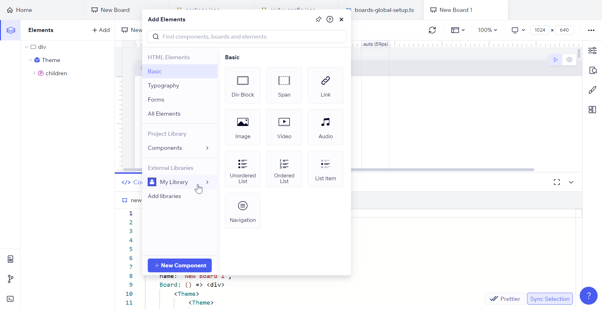
At any point, you can go to the Add Elements panel and check on the component variants in your library in the Project Library > Components section.
Step 2: Install, Configure, and Build with Codux Librarian
Codux Librarian is a CLI tool we created for packaging your boards into a format that can be consumed in other projects through the Add Elements panel.
Install Codux Librarian in your project using the following command:
1npm install --save-dev @wixc3/codux-librarian
Once installed, create a
codux-librarian.config.json file in the root directory of your project.Configure Codux Librarian
Now you'll configure the codux-librarian.config.json file created above. When you run Codux Librarian, the configuration from this file will be used to create a package.json file for the board library. It will also create a manifest file with the Library's name, icon, and the boards contained in it (along with their cover images).
Here's an example codux-librarian.config.json file:
"buildDir": "package",
"boardsPath": "src/_codux/boards",
"libraryName": "My Library",
"libraryIcon": "src/assets/icons/icon.png",
"packageName": "@myorg/mypackage",
"packageVersion": "1.0.5"
"buildDir": Name of the folder for output (in the root of the project)."boardsPath": The relative path to the project's boards directory.-
"libraryName": The name for the library, as visible in the External Libraries section of the Add Elements panel. "libraryIcon":The icon for the library, as visible in the External Libraries section of the Add Elements panel.
Build with Codux Librarian
At this point, you're ready to build your library of boards. Run the following command from the root of your project:
1npx codux-librarian build
Step 3: Publish Your Project
The last step is to publish your library of boards. Navigate to the new folder created in the project directory named as you specified in codux-librarian.config.json, and publish it:
1npm publish
Tip!
You may wish to configure project scripts to make it easier to rerun these commands from within Codux whenever you've made changes to the library.
Step 4: Consume the Project Library in Your App
Now that you have published your library, you can begin to consume it in other projects. To add and consume your components and variants through the Add Elements panel:
Install Your Library in the App Consuming It
Using the scoped NPM package name entered in codux-librarian.config.json in the earlier step, install the library that you published. For example:
npm install @myorg/mypackageNote:
If you're not a developer and don't use a CLI, you can still add the dependency by adding it to the project's package.json file, and then running the install project script in Codux.
Add the Installed Library to the Add Elements Panel
The final step to start using your library's content via the Add Elements panel involves configuring the
codux.config.json file. Use the addPanel/assets key to reference your library's NPM package as described here.Install the Dependencies Used in Your Library
Any project consuming your library requires the same dependencies as were required to create the library. For example, because our example library contains a button from Radix UI and we installed Radix's dependency in our library project, we'd install the Radix dependency in every project consuming our library as well (in this case, by using
npm install @radix-ui/themes).Globally Import CSS Files
Some components from external libraries rely on stylesheets (like the one we saw in the board file example using Radix library). In the original project used to create the boards, each board file had its own imports, but when adding a variant from the Add Elements panel, these stylesheet imports are not copied to the target board file. For this reason, you have to import them yourself, either individually in each board that requires the stylesheet, or globally so that every board will have access to the imported asset through boards-global-setup.ts.
In the case of our Radix UI component, our boards-global-setup.ts file looks like this:
1 2// boards-global-setup.ts import '@radix-ui/themes/styles.css';
Use boards-global-setup.ts to import your library's stylesheets as per your needs.
Now it’s time to reopen the project.
Finale: Opening the Add Elements Panel
Once you've configured your external library in the codux.config.json file and ensured that all necessary stylesheets and dependencies are imported and installed in your project, you can access your external library's component variants in the Add Elements panel under the External Libraries section. Each component variant in your library is represented by the cover images you've captured. You can add these to your project by either clicking on them or dragging them to the Elements panel.
Important!
Codux doesn't currently recognize context providers in third party library components. If your library wraps elements in a context provider (i.e.
<Theme>), each individual component variant added from the Add Elements panel will be wrapped in the context provider as opposed to being automatically nested. This may result in incorrect code.Was this article helpful?