Codux Help Center
Browse our articles to find the answers you need
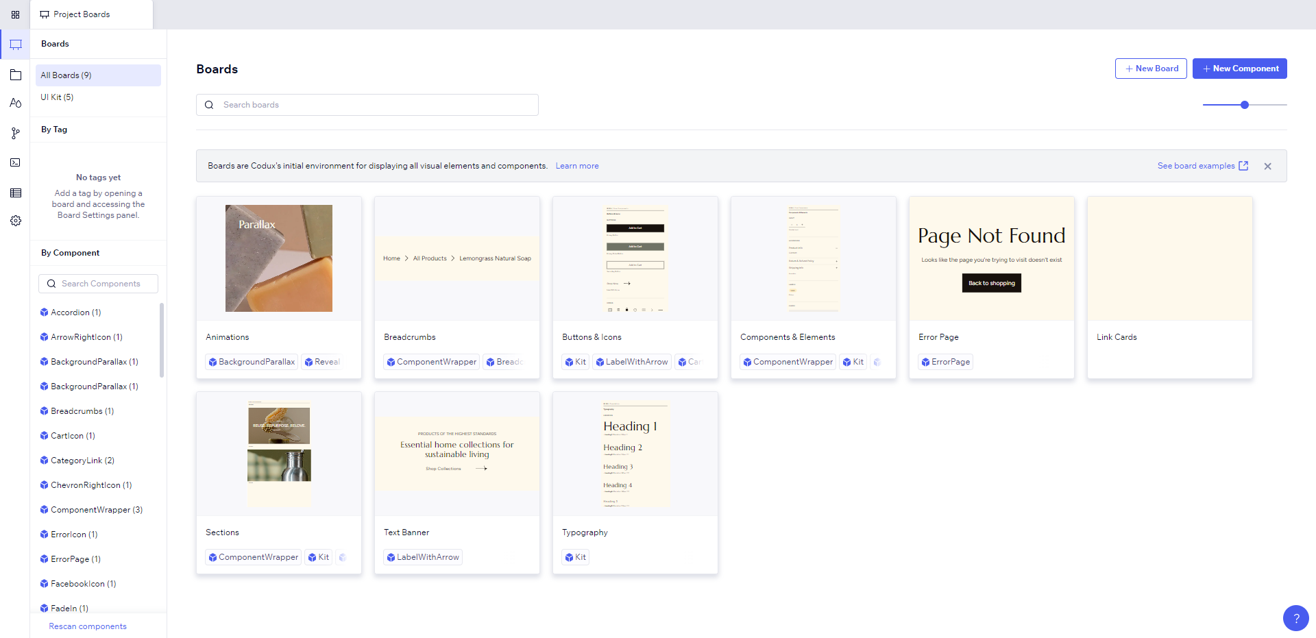
What are boards?
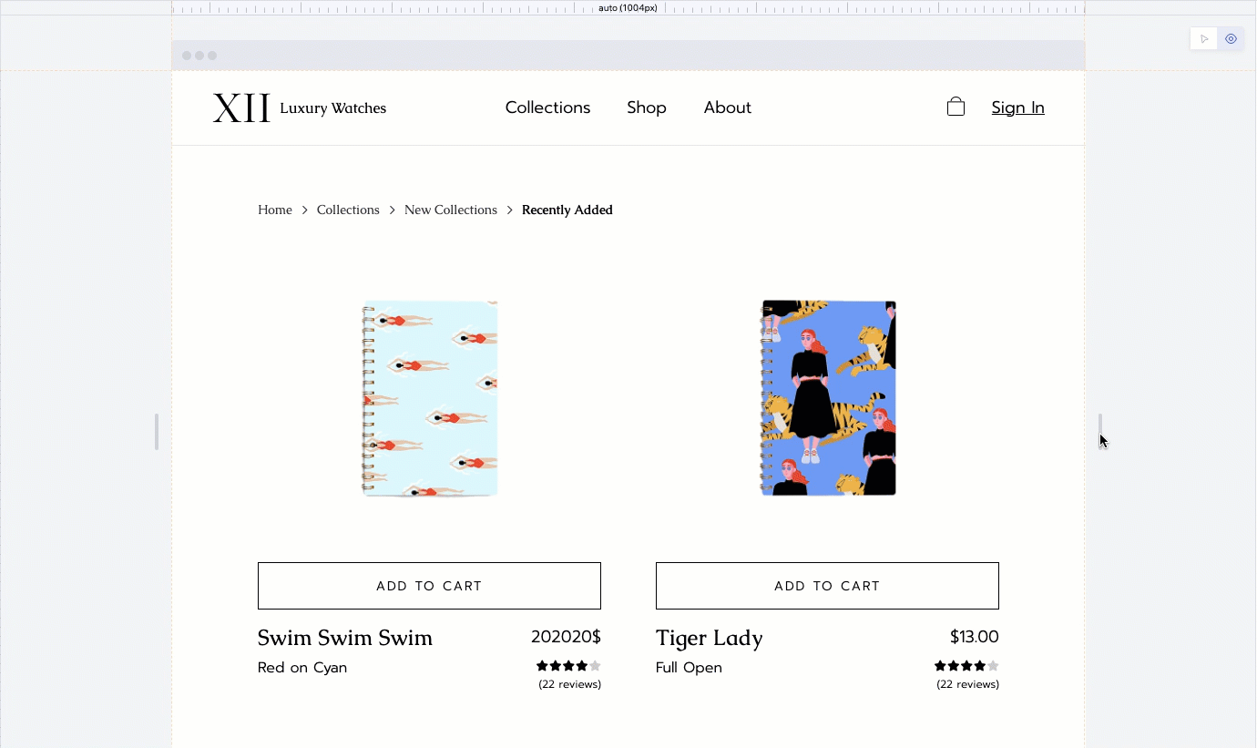
In Codux, a board is an isolated environment where you can experiment with different settings for your components. It's a place where you can provide your components with all the properties, providers, and hooks that they may need so that Codux can render them and let you edit them visually.
Codux gives you a chance to thoroughly test and develop your components on boards by letting you:
- Examine their appearance and behavior in various window sizes.
- Experiment with different alignments and padding settings.
- Create different permutations and mock states using props.
- Test various sizes and variations in isolation.
- Edit components in conditions that are harder to simulate their look and behavior of within the actual app.
- Create variants by wrapping elements so that they are available for reuse across your app or other components.
Thoroughly testing your components means that you'll be able to find and fix the parts of your app that don't quite look or behave as you might have hoped. Not only can you see how your components look in their various configurations, but also how they look inside other components of various configurations (since components commonly contain other components).
Creating Boards
To create a new board, select a component from the component list on the left and click New Board at the top right of the screen.
You can also create a new board without first selecting a component. Assuming you selected one first, the dialog will look like this:
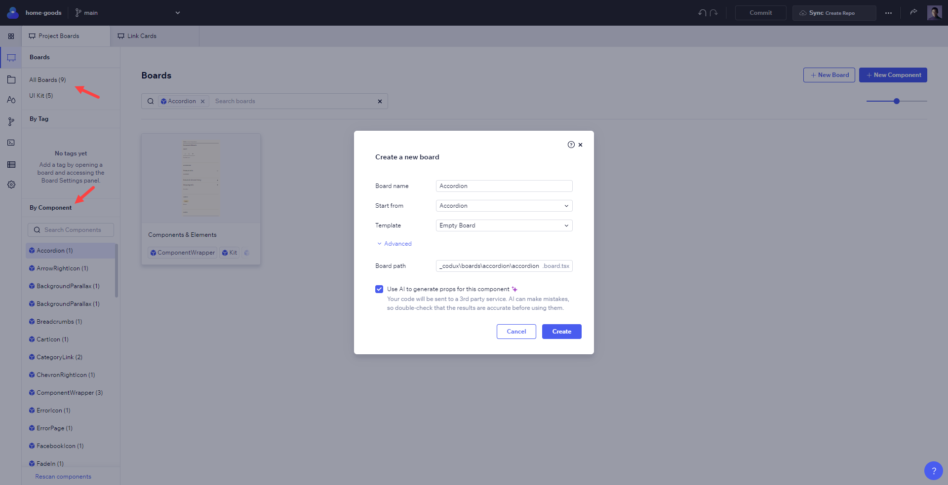
- Give the board a name. As best practice, give it a name that indicates what you intended for it to show, and how it may affect the component. For example, Mobile View, Large Pic, or Long Title make for descriptive names that shed some light on the environmental settings, component types, and properties that they may use.
- By default, Codux will start the new board with the selected component already in it. To start with an empty board instead, choose Start from > Blank.
- Codux comes with a board template built in, containing only a single div inside. If you have your own template to use for your new board, select it here. To learn about board templates, see here.
- The board path (hidden under Advanced) lets you change the path where the new
.board.tsxfile will be saved. Change at your own discretion. - Codux can generate the properties for your board using AI to get you started with the new board quicker. Your component code will be sent to a third party service, where AI will generate properties for the component automatically. AI can make mistakes, so double-check what you got in your board!
Adjusting the Window Size
The window size can also be adjusted directly from the top bar in Codux and the sizing handlers on the state.
From the top bar, either enter a custom resolution in the width and height fields (in pixels), or select from the list of predefined device profiles built into Codux.
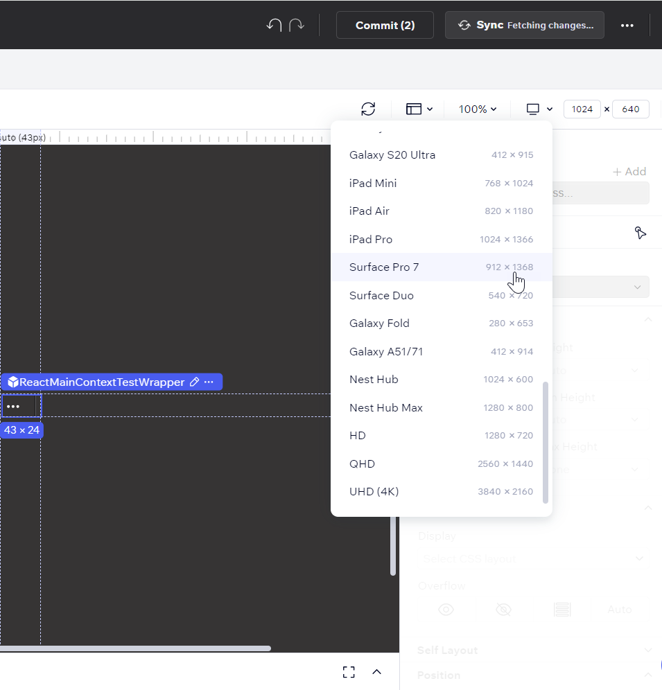
From the stage, resize the window by grabbing the sizing handlers and dragging them.
Board Settings
Codux provides a user-friendly interface to adjust board settings via the Board Settings panel on the left side of the screen.
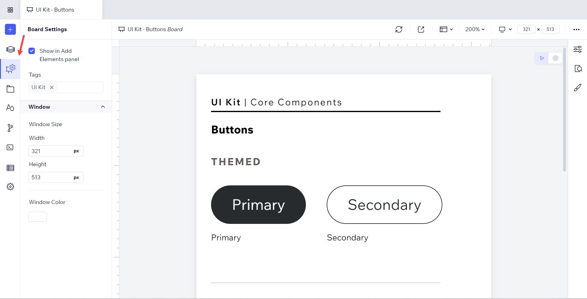
Here you can change:
- Show in Add Elements panel: Codux lets you reuse components and elements across your project through the Add Elements panel. When you create a variant of a component or element, it appears in the Add Elements panel automatically. To prevent all the variants from a specific board from appearing in the Add Elements panel, deselect this setting.
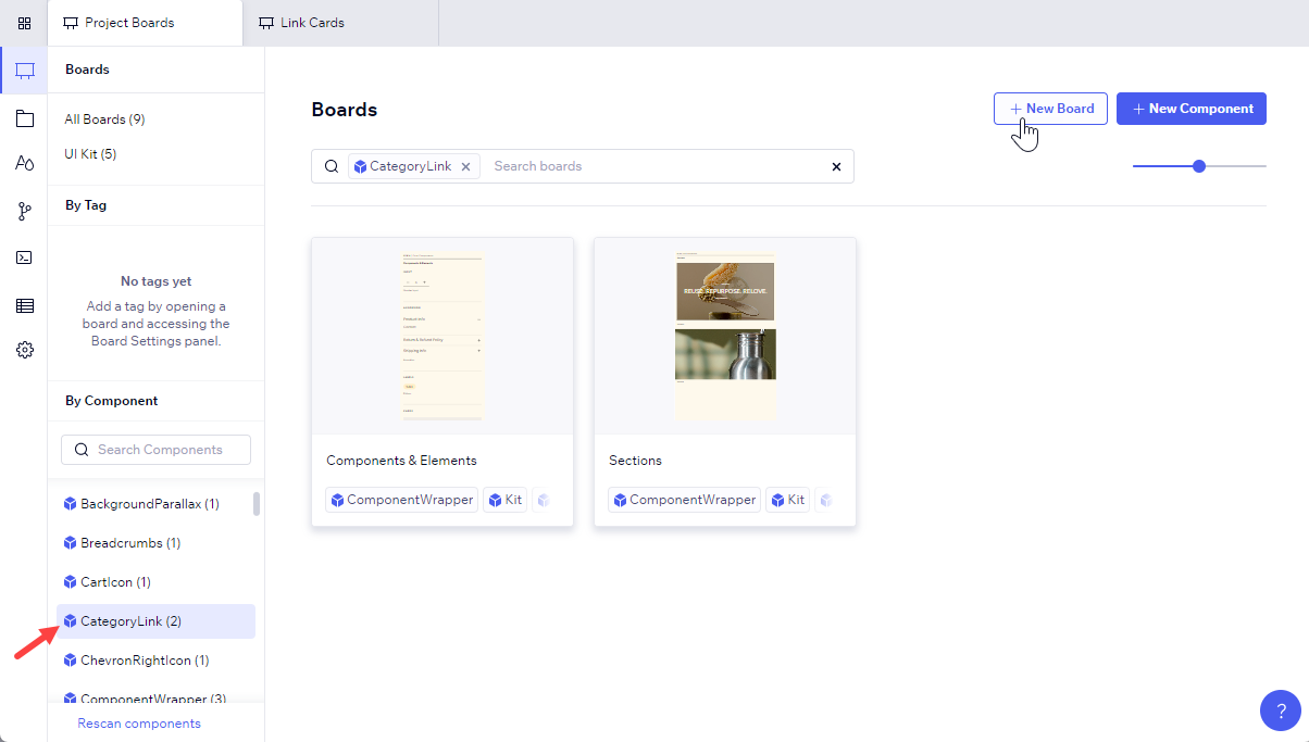
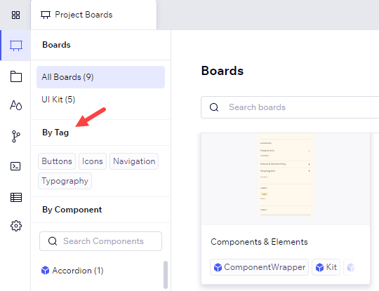
- Tags: This is where you can add tags to your board for easy identification and access. These tags will appear on the Project Boards screen above the list of components, so you can filter boards by those with that same tag.
- Window Settings: This section allows you to customize the viewing environment for your components. Window Size lets adjust the size of the application window, enabling you to visualize how your components appear and function across various screen sizes (useful for testing responsive designs and ensuring your components adapt well to different viewport dimensions). Window Color lets you change the background color of the application window. It simulates different app backgrounds, helping you assess how your components and other elements look and contrast against various color schemes.
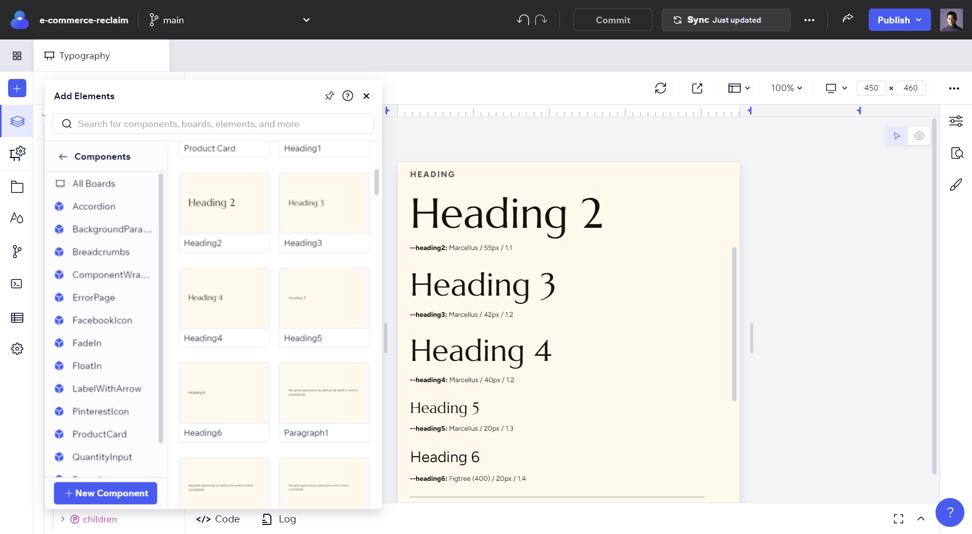
Add Your Assets to the Add Elements Panel
Once you get the components and HTML elements in a board looking the way you like, you can reuse that specific permutation of its props, states, and styles so that you only need to design it once.
For example, you might have several typography-related variants. Once you create these, you can see them in the Project Library section of the Add Elements panel, and add them to your app with just a drag or click.
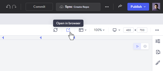
Viewing and Debugging in Isolation
To view and debug your components outside a board, undisturbed by a board's settings, as well as to access developer tools, click Open in browser from the top tab.
Important!
When working with components in boards, it's important to understand that elements like imported stylesheets, applied class names, passed properties, and executed logic are external to the component itself. This means that when you take the component and use it in your app, it may not look the same as it did while in a board. Boards may provide context that's absent in the app environment, or vice versa.
Was this article helpful?