Codux Help Center
Browse our articles to find the answers you need
Component Libraries in Codux
If you’re here to install pre-configured React Bootstrap, Semantic UI, Nivo Charts, Blueprint, or React Charts rich content component libraries to an existing project, jump to here.
Codux supports third-party component libraries, giving you access to pre-built, reusable components for your design system. Once you add a library to your project, you can instantly preview and drag components into your project from the Add Elements panel.
Pre-configured Component Libraries
Codux offers several production-ready component libraries that you can add to your projects. Each includes components with proper styling, states, and interactions already configured.
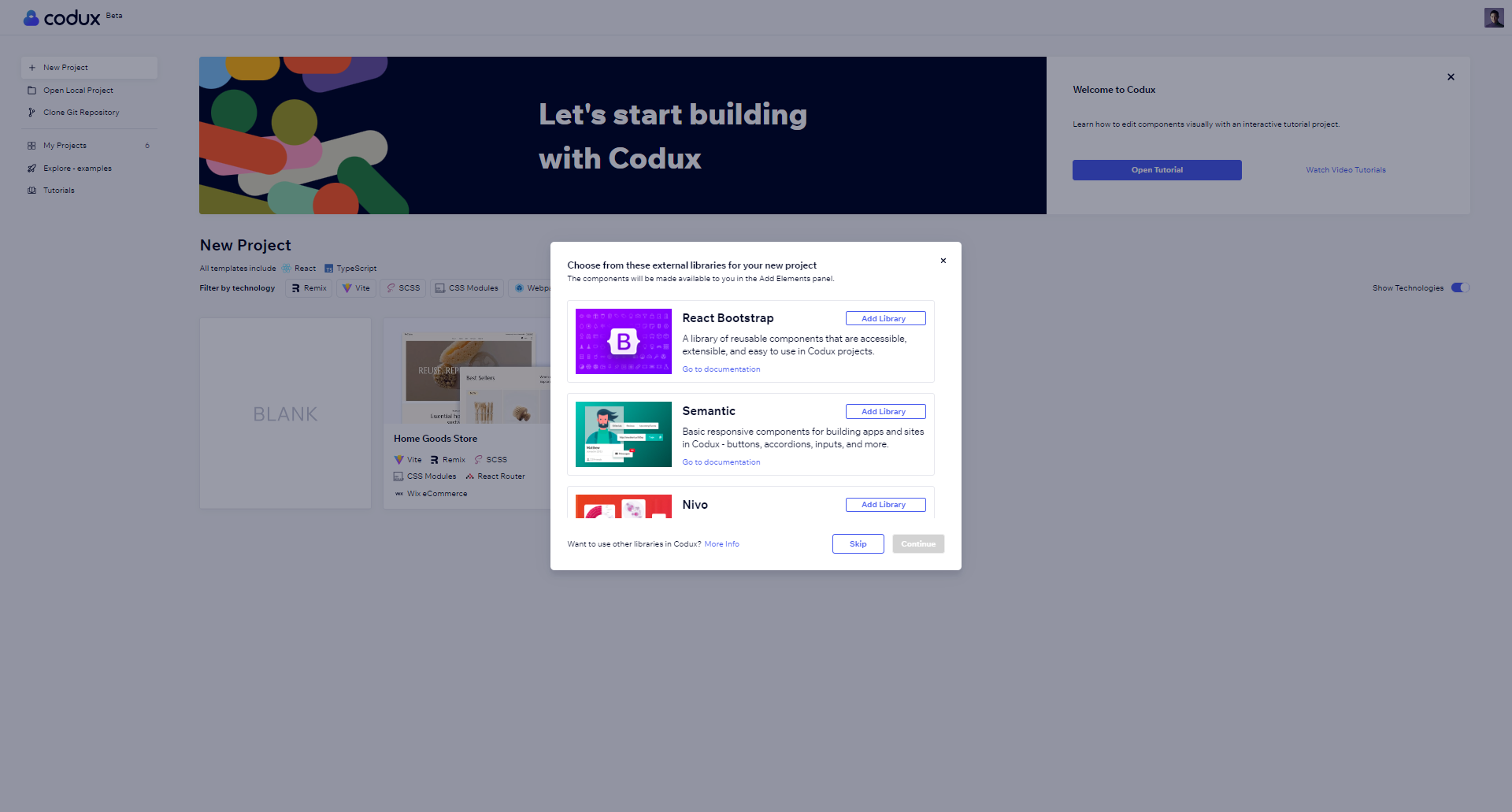
- React Bootstrap: React Bootstrap provides a comprehensive collection of UI components built specifically for React. The library includes responsive grid components, navigation elements, form components with built-in validation, modal dialogs, popovers, alerts, notifications, and various layout elements like cards and accordions.
- Semantic UI: Semantic UI provides components for creating responsive layouts. The pre-configured components include grid systems for page layout, content cards, navigation menus, forms with validation, message displays, and modal dialogs. Each component adapts to different screen sizes and maintains visual consistency across your project.
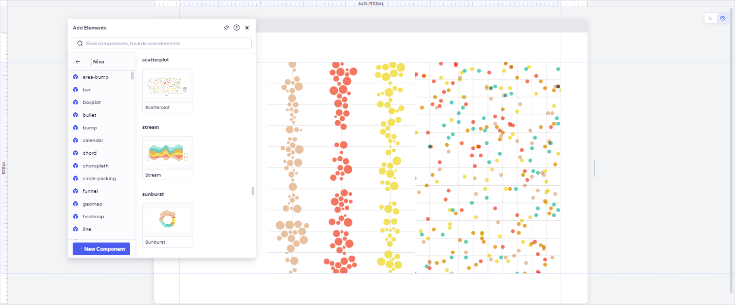
- Nivo Charts: Nivo offers data visualization components. The pre-configured charts include bar charts, line charts, pie charts, heatmaps, radar charts, and stream charts. Each chart comes with interactive features and customizable styling options.
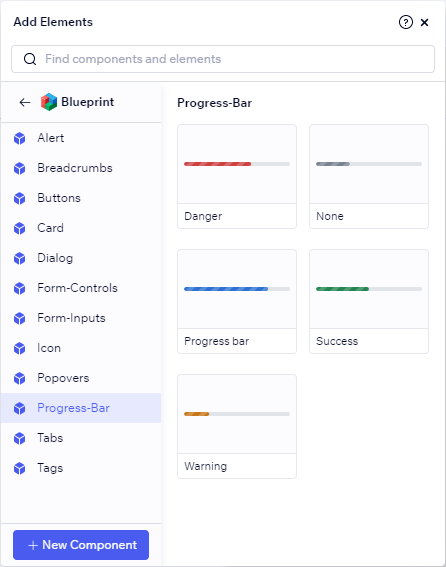
- Blueprint: Blueprint is a UI toolkit for web applications. The pre-configured components include form elements with validation states, navigation components, buttons, input fields, dialog boxes, modals, data visualization components, and toast notifications. Each component maintains consistent styling and behavior, with proper accessibility features and responsive design built in.
Adding Pre-configured Component Libraries
Method 1: During Project Creation
The easiest way to add React Bootstrap, Semantic UI, Nivo Charts, or Blueprint is when creating a new project. Simply select any of these pre-configured libraries from the new project screen. Their components will be immediately available in the Add Elements panel.
Method 2: Adding to Existing Projects
Codux provides pre-configured packages for React Bootstrap, Semantic UI, Nivo Charts, Blueprint, and React Charts. Here’s how to install them from terminal:
1 2 3# React Bootstrap npm install react-bootstrap bootstrap npm i -D @codux-boards/react-bootstrap
1 2 3# Semantic UI npm install semantic-ui-react semantic-ui-css npm i -D @codux-boards/react-semantic
1 2 3# Nivo Charts npm install @nivo/core @nivo/bar @nivo/line # (add other needed components) npm i -D @codux-boards/react-nivo
1 2 3# Blueprint npm i @blueprintjs/core @blueprintjs/icons npm i @codux-boards/react-blueprint
1 2 3# React Charts npm install react-charts@beta --save npm i -D @codux-boards/react-charts
For each of these libraries, add to your
codux.config.json:1 2 3 4 5{ "addPanel": { "assets": ["@codux-boards/react-blueprint"] // or react-semantic, react-nivo, react-blueprint, react-charts } }
React Bootstrap, Blueprint, and Semantic UI require additional CSS imports in
boards-global-setup.ts:1 2// For React Bootstrap import 'bootstrap/dist/css/bootstrap.min.css';
1 2 3// For Blueprint import '@blueprintjs/core/lib/css/blueprint.css'; import '@blueprintjs/icons/lib/css/blueprint-icons.css';
1 2// For Semantic UI import 'semantic-ui-css/semantic.min.css';
Creating Your Own Component Library
Create and share reusable component libraries for Codux by designing them in a dedicated project. You can use boards to showcase your components' different states and variants. Once you build and publish your library, other developers can install it in their Codux projects, where your components will appear with visual previews in the Add Elements panel.
1. Create Component Boards
Start by creating boards that demonstrate your components:
- Create and design boards that showcase each component's functionality and variants.
- Add cover images for your components in the project's
coversdirectory to display in the Add Elements panel - Include descriptive tags to make components easily discoverable.
Important Notes
- CSS files must be imported globally, not in board files
- Component imports must use external package paths, not relative paths
- Cover images must use relative paths and include file extensions
- Each board file must contain exactly one return statement
You can track your progress by checking the Project Library > Components section in the Add Elements panel.
2. Set up Codux Librarian
Codux Librarian packages your boards for use in other projects. First, create an NPM account if you don't have one and choose a scope name for your package (e.g.,
@mycompany/my-components).Install Codux Librarian in Your Project
1npm install --save-dev @wixc3/codux-librarian
Create
codux-librarian.config.json in your project root with the following properties:1 2 3 4 5 6 7 8 9 10 11 12 13{ // Build configuration "buildDir": "package", // Output folder location "boardsPath": "src/_codux/boards", // Path to your boards // Library display settings "libraryName": "My Library", // Display name in Add Elements panel "libraryIcon": "src/assets/icons/icon.png", // Library icon // NPM package settings "packageName": "@mycompany/my-components", // Your scoped NPM package name "packageVersion": "1.0.0" // Initial version }
3. Build and Publish
Once your configuration is ready, run these commands in your project directory:
1 2 3npx codux-librarian build cd {buildDir} npm publish
4. Use in Projects
To use your published library:
a. Install your published package
To make installation easier for other project users, add an installation script to your project's
codux.config.json that includes both your library and its dependencies:1 2 3 4 5 6 7 8 9 10{ "$schema": "https://wixplosives.github.io/codux-config-schema/codux.config.schema.json", "scripts": { "install-my-library": { "title": "Install My Library", "description": "Install my component library and its dependencies", "command": "npm install @myorg/mypackage dependency-one dependency-two" } } }
b. Add your library to codux.config.json
Configure the addPanel/assets key in codux.config.json, so your library will show up in the Add Elements panel:
1 2 3 4 5{ "addPanel": { "assets": ["@myorg/mypackage"] } }
c. Import any required stylesheets
Some libraries depend on stylesheets to use their components, and therefor you need to import the sheet globally using
boards-global-setup.ts. For example:1import '@myorg/my-library/dist/styles.css';
Component Mapping (Experimental)
For a simpler approach that doesn't require boards or publishing, you can use component mapping. While this method is easier to set up than the method described above, note that components won't have visual previews in the Add Elements panel.
Things to Keep in Mind
- Components appear exactly as configured in the JSON file.
- Components won't have pre-configured property values.
- For components with required props, Safe Render will indicate this.
- Codux doesn't validate library names, component existence, or paths.
- Invalid configurations will trigger error messages when adding components.
Tips for Managing Your Configuration
- Use Regex to automate adding new components to your JSON file.
- Search patterns can help locate the correct insertion point.
- You can script the process of inserting new component details in the correct format.
- Consider maintaining a template for consistent component entries.
Create
codux-external-components.json in your project root and map your components like this:1 2 3 4 5 6 7 8 9 10 11[ { "name": "My Components", "components": [ { "filePath": "component-path", "exportName": "ComponentName", "name": "Display Name" } ] }
Understanding Component Configuration
Property | Purpose | Example |
|---|---|---|
filePath | Package or file path | "my-components" or "@myorg/package" |
exportName | Component's export name or "default" | "Button" or "default" |
name | Display name in Add Elements panel | "Custom Button" |
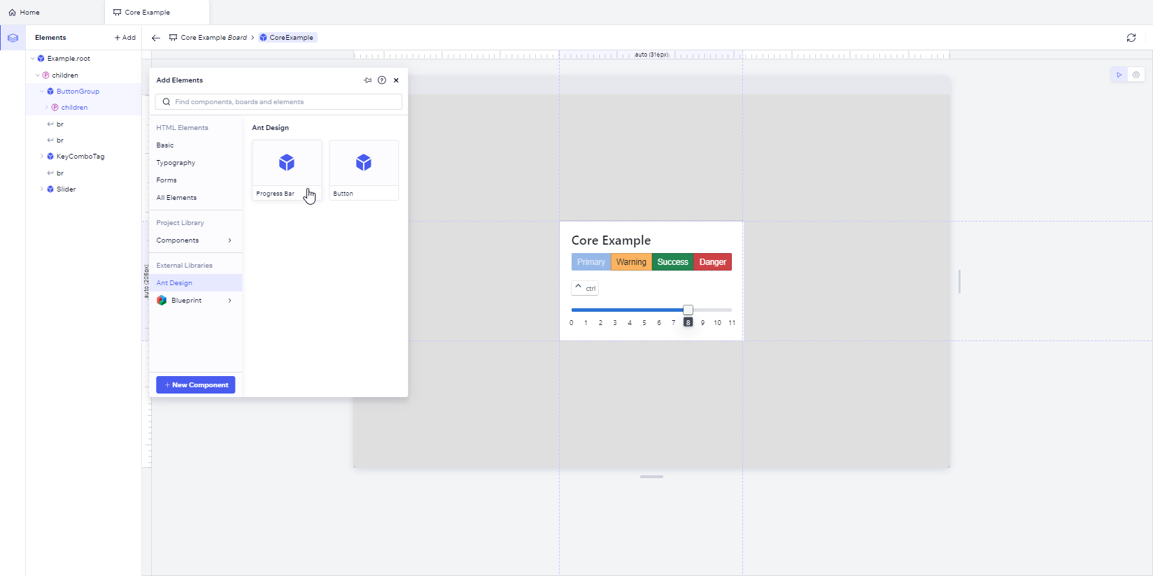
Codux uses the information provided in the JSON file to present the components in the Add Elements panel like this:
Working with Different Export Types
When you include a component in your JSON file and later add it through the Add Elements panel, Codux automatically adds the correct import statement to your code. The import syntax differs based on whether the component uses a named or default export.
Named Exports
When you import a named export, you must use the exact name from the export statement:
1 2 3 4// In component file export const Button = () => { return <button>Click me</button> }
1 2// How it gets imported import { Button } from "my-components"
1 2 3 4 5 6// In codux-external-components.json { "filePath": "my-components", "exportName": "Button", // Use the exact export name "name": "Custom Button" // Display name in Add Elements panel }
Default Exports
With default exports, you can use any name when importing:
1 2 3 4// In component file export default function Button() { return <button>Click me</button> }
1 2// How it gets imported import MyButton from "my-components"
1 2 3 4 5 6// In codux-external-components.json { "filePath": "my-components", "exportName": "default", // Use "default" for default exports "name": "Custom Button" // Display name in Add Elements panel }
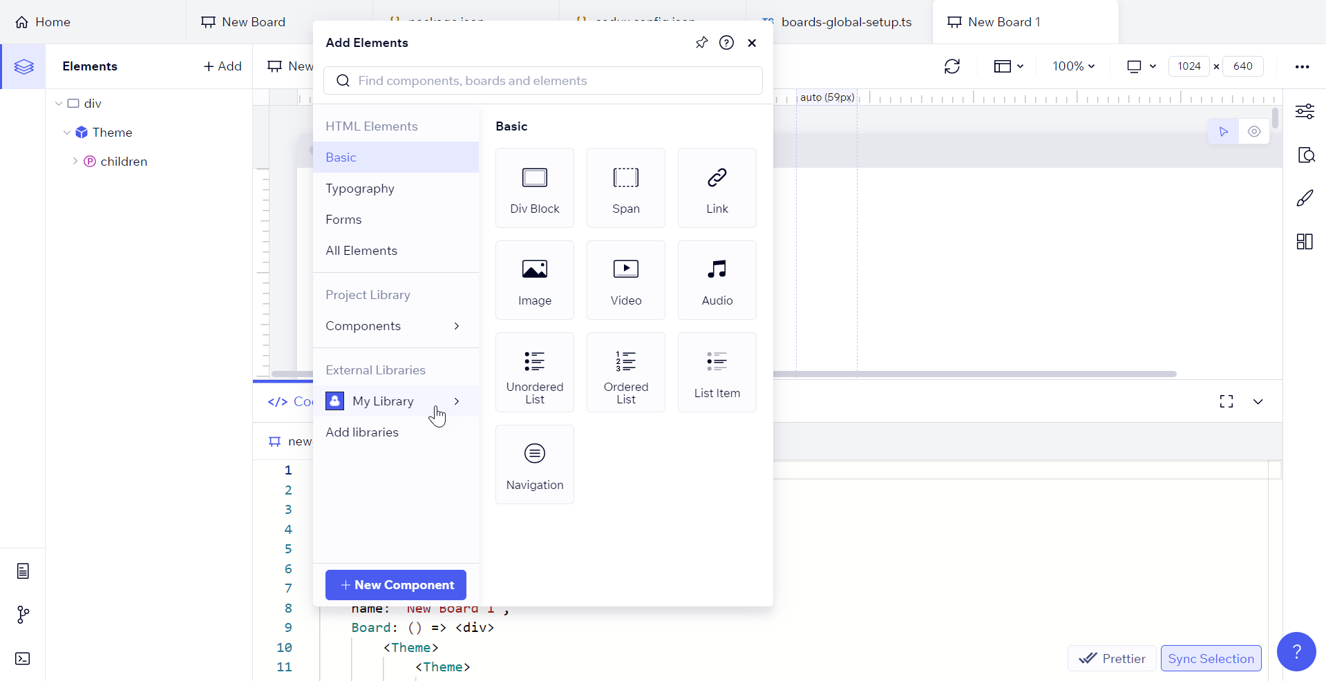
Viewing Libraries in the Add Elements Panel
Once added to your project, all library components appear in the External Libraries section of the Add Elements panel. You can add these components to your project by either clicking them or dragging them to the Elements panel.
Important!
If your library uses context providers (such as
<Theme>), note that Codux wraps each component with its own provider when added from the Add Elements panel, rather than nesting them under a single provider. This can result in redundant providers and potentially incorrect component behavior.Was this article helpful?