Codux Help Center
Browse our articles to find the answers you need
Elements Panel
As you may know, elements are the building blocks of components. Components may contain any number of HTML elements and inner components inside them.
When you open a board in Codux, you'll see on the left side of the UI a panel called the Elements panel. This panel shows a visual representation of a component's structure (its JSX, which can be thought of as the HTML of your component).
For a walkthrough of the panel, be sure to check out this video:
In the image below, you can see an Elements panel filled with various elements. Notice how all the component's elements show in a tree, sorted according to their hierarchy, where child elements appear indented beneath their parents.
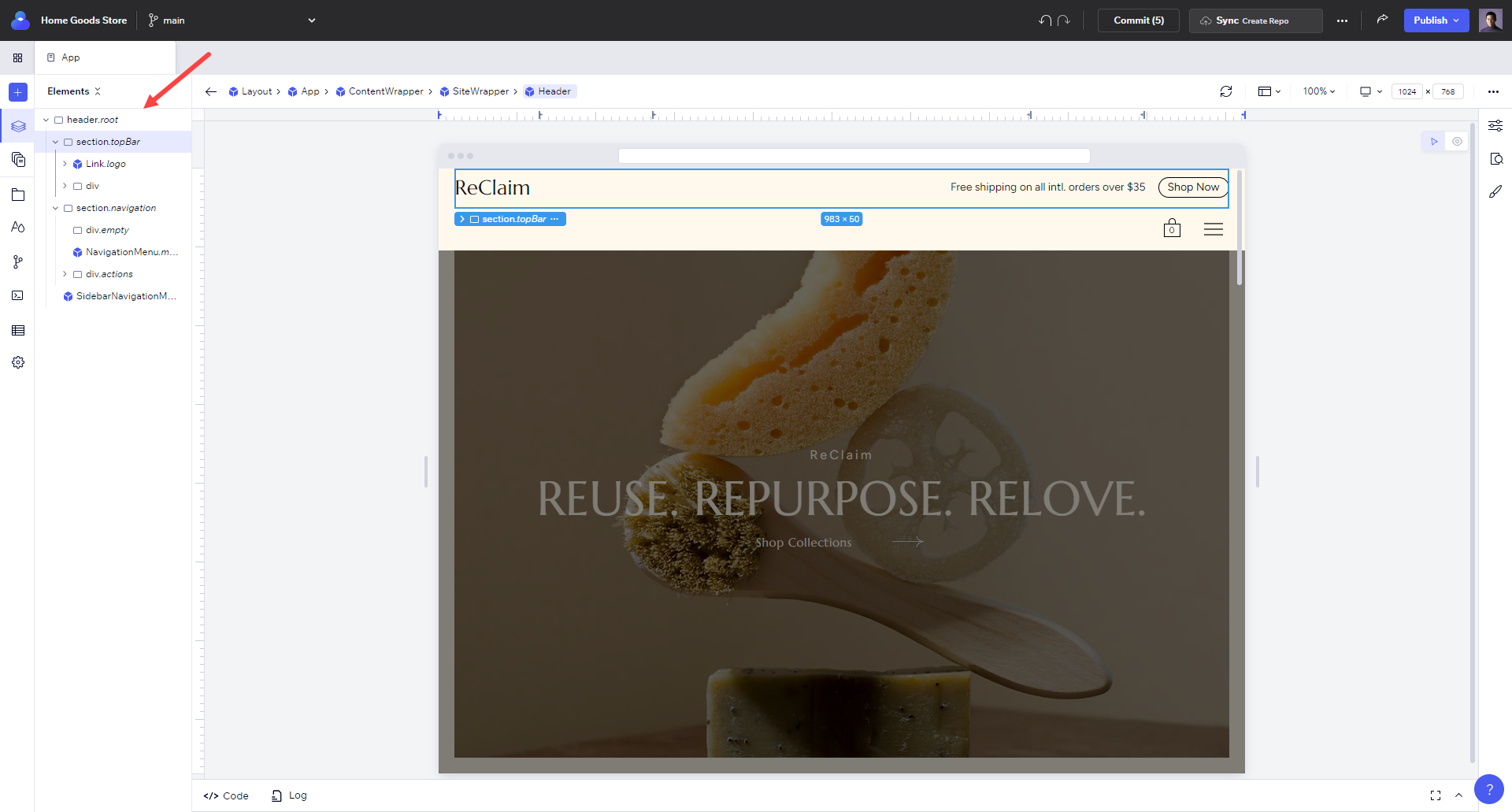
The selected element, sandwiched between other HTML elements, is referred to as an inner component. In this case, it is also a repeater, as indicated by the element icon. The repeated element, 'boxes', was written once in the code, and helped produce the tutorial project lesson that you see above.
Understanding Scopes
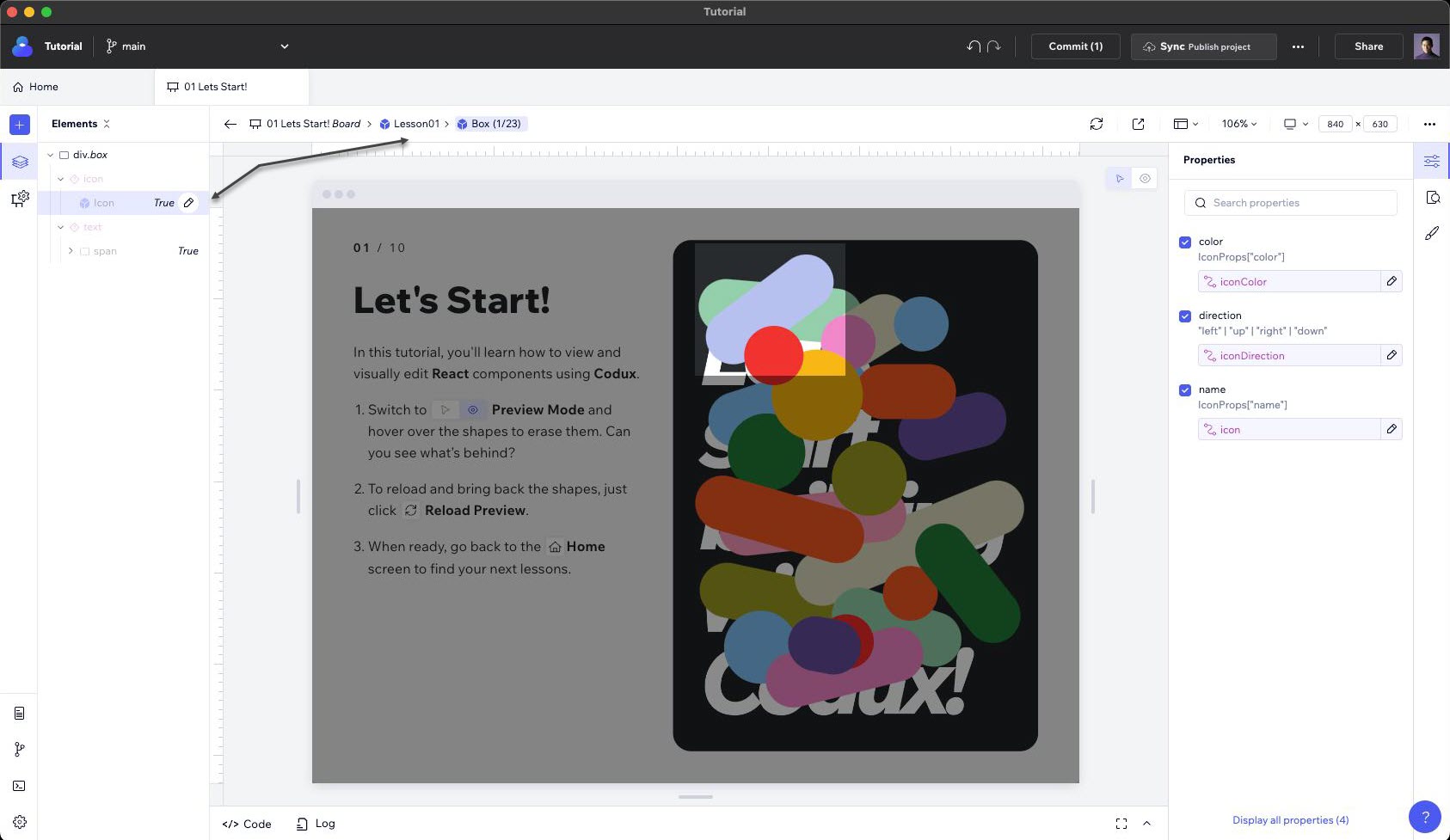
When working with components in Codux, it's essential to understand scopes. Scopes allow you to explore the structure of your components and dive into their inner elements. Click on the pencil icon next to a component or element in the Elements panel to drill in, double-click on the node itself, or hit the "Enter" key on your keyboard. As you drill into a component, you'll see its inner scopes. These represent the nested elements within that component. Keep drilling in until you find the specific selection that interests you. The breadcrumbs at the top of the panel reflect your current scope.
If you want to backtrack, you can drill out by clicking on the parent scopes in the breadcrumbs.
Viewing an Element's Properties and Styles
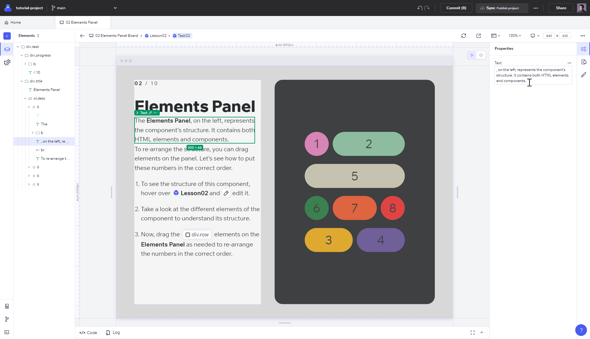
When you use Codux, you're probably editing a specific element. Codux is dependent on you selecting specific elements to style and edit the properties of, so select an element from the tree or the stage to view and edit its properties and styles from the panels on the right.
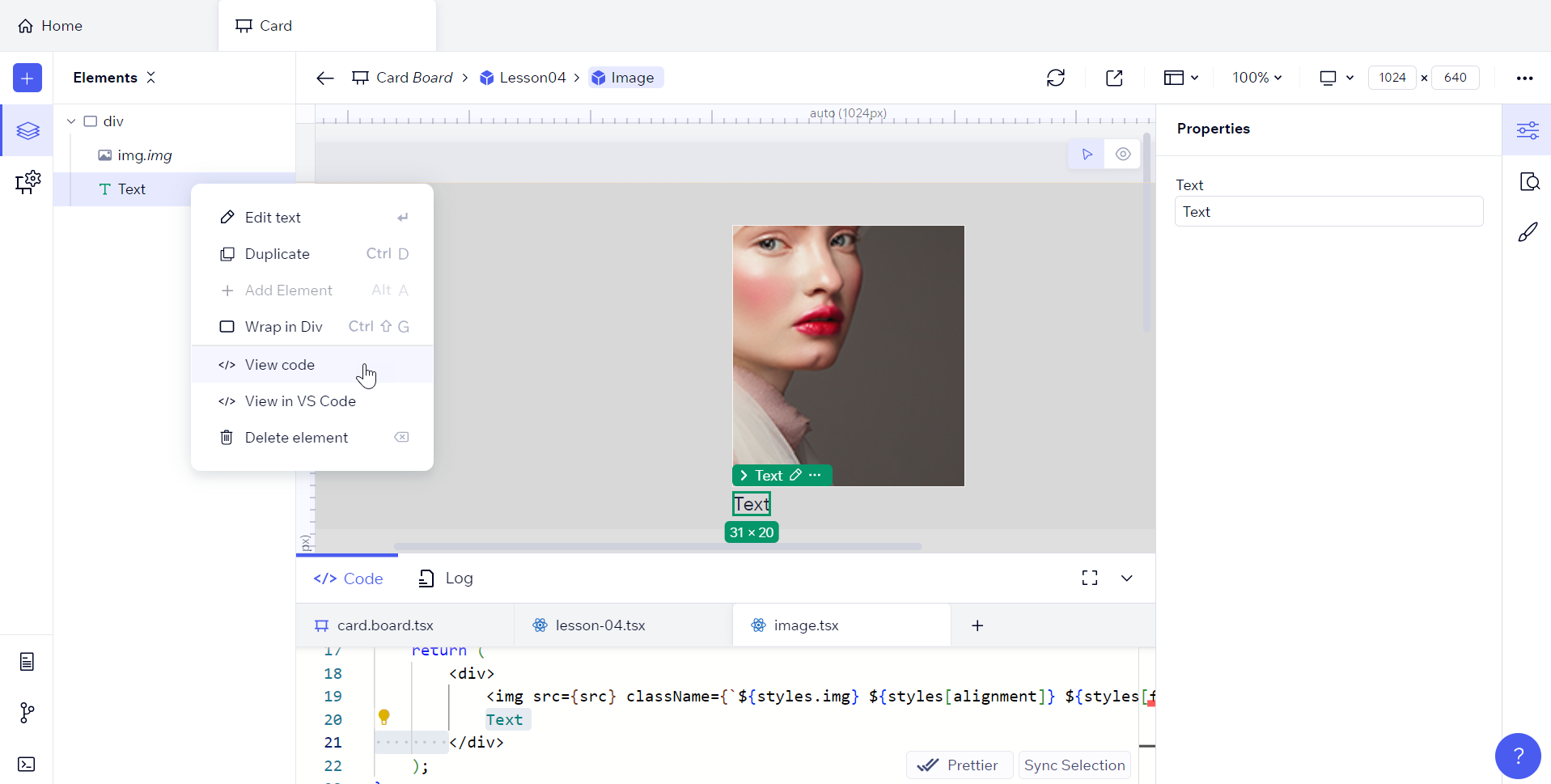
You can also edit an element from its code. Select </> View code from the element's menu options to open it in the built-in code drawer (or Open in VS Code to open it in your IDE).
Adding Elements to Components and Boards
The Add Elements panel provides a quick, visual way to add new HTML elements and inner components to your components. Simply drag and drop an element from the Add panel (accessible from the + icon) to the Elements panel to add it to your component.
For more information, and for instructions on adding external component libraries to your projects and making their components accessible from the Add Elements panel, refer here.
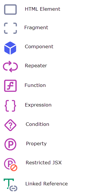
Element Types
The Elements panel indicates the type of each element. By 'type', we mean one of the following:
HTML Element
Fragment
Component
Repeater
Function
Expression
Condition
Property
Restricted JSX
Linked Reference
Child
Here's a legend to help you identify the type:
Rearranging Elements
It's easy to rearrange elements in the Elements panel by dragging them. Say you wanted to rearrange the order that components show in your app - nothing to it!
Important!
Behind the scenes, Codux rearranges the structure of your component (its JSX code) as you rearrange elements visually. It is not changing its CSS. To create specific layouts, use the Styles panel.
Note:
It isn't possible to drag repeater or fragment elements because their order can't be declared. As your app runs, JavaScript logic makes these elements appear multiple times, and because logic is determining their order, it isn't possible to rearrange them in the element hierarchy.
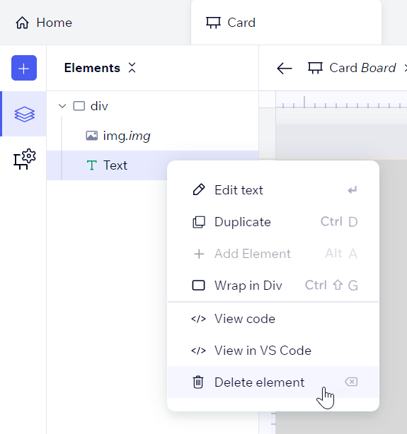
Editing and Removing Elements
When you right-click on a component in the Elements panel, you'll see various actions available for the element, such as drilling into it to edit it, duplicating it, resetting its states, viewing its code in the code drawer or IDE, and deleting it.
You can also duplicate an element by selecting the original, pressing the Alt key, and dropping the copy in its new location.
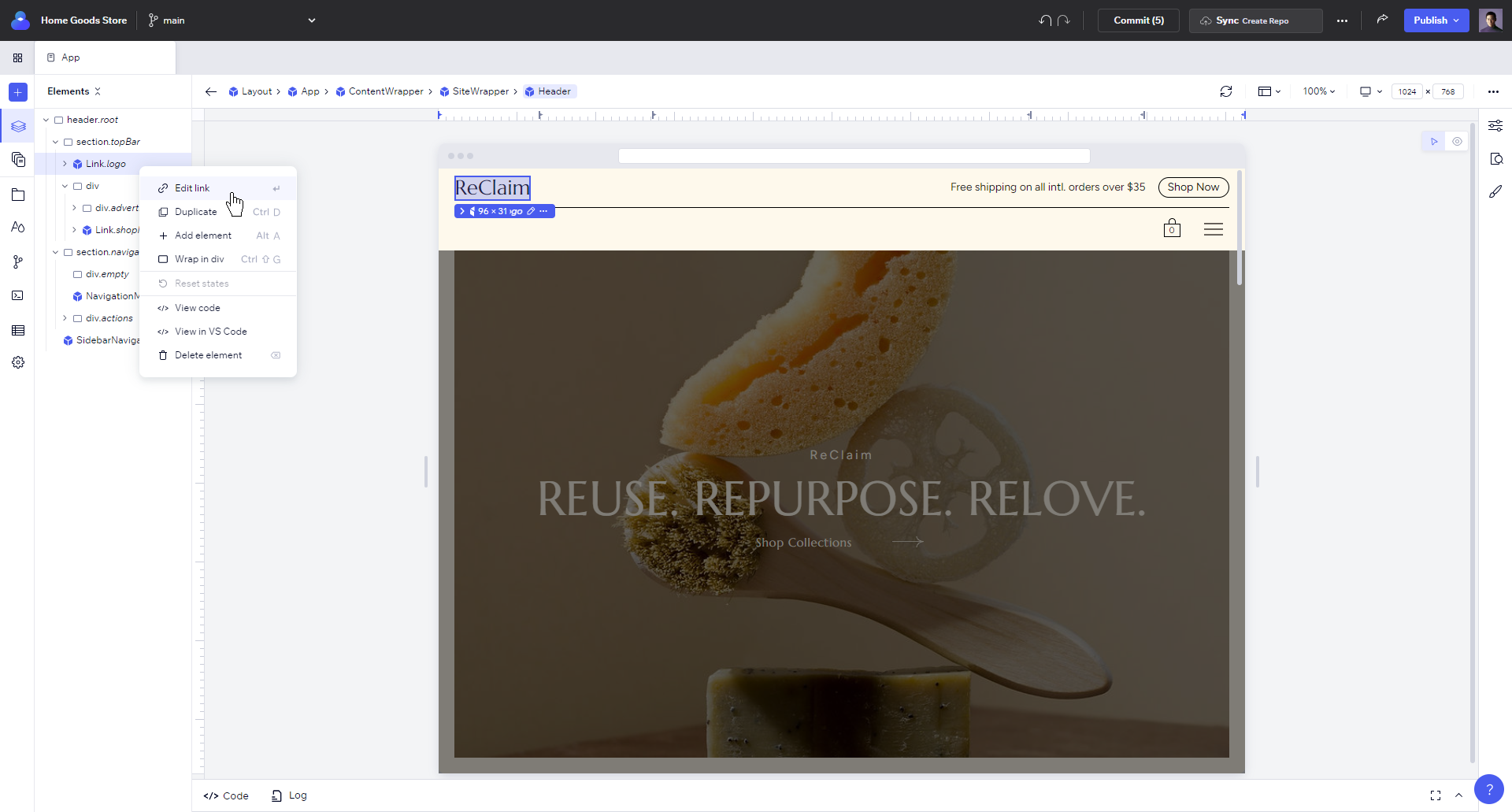
Editing Links
When you right-click link elements (<a> HTML elements, and Link or NavLink components) or hit Enter, you'll see an Edit link option.
Select this option to view the link settings. You may link to app pages and dynamic page if the selected page has one and website URLs, and create clickable email addresses and phone numbers.
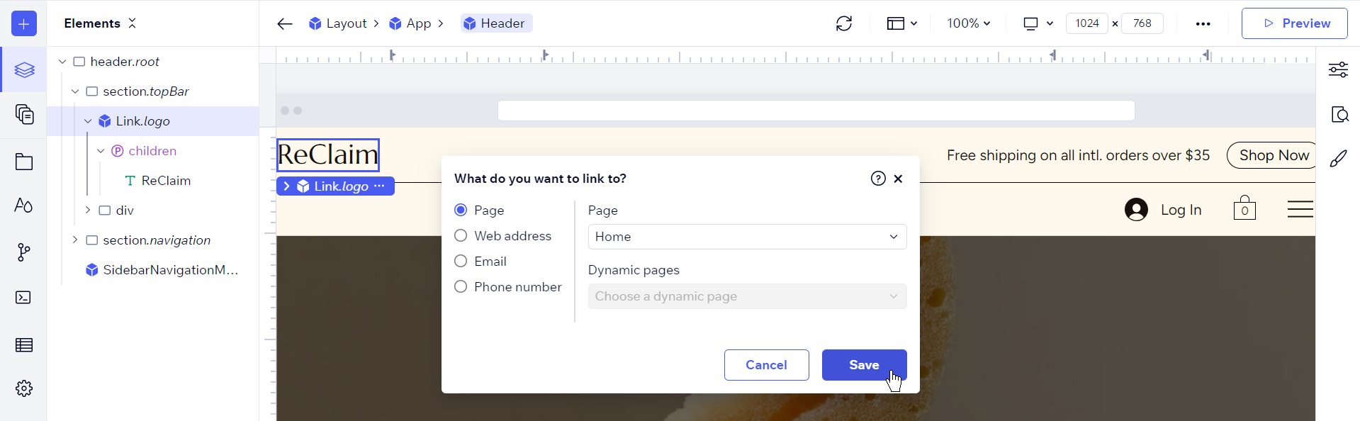
You can also access this dialog by clicking the Edit Link beside the
to property in the Properties panel. 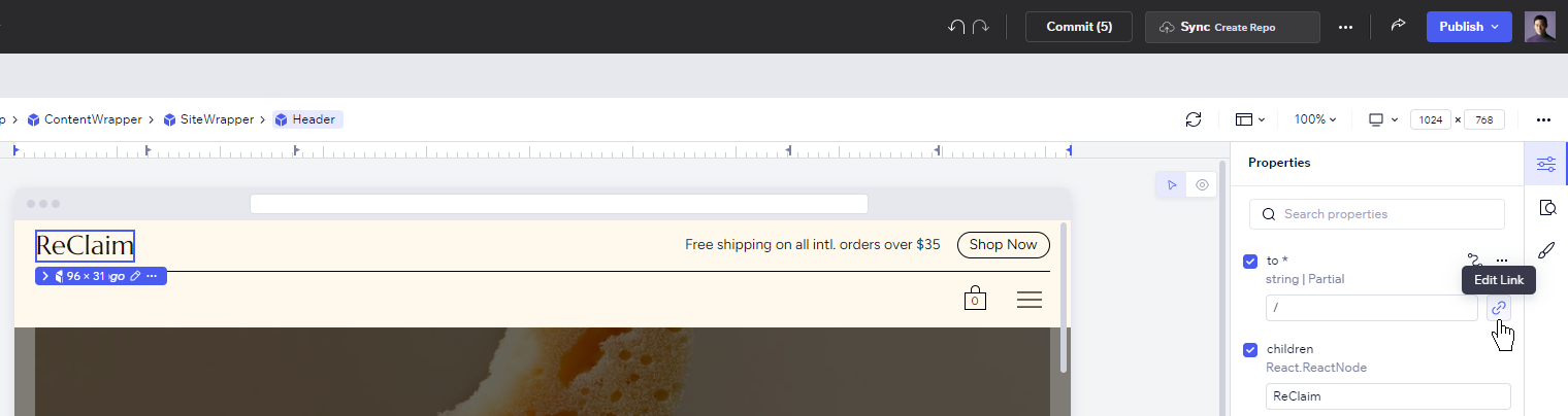
Was this article helpful?