Codux Help Center
Browse our articles to find the answers you need
Properties Panel
Codux automatically scans your components for properties and generates corresponding inputs in the Properties panel on the right side of the screen. For instance, if you have a Button component, Codux identifies its properties (such as label, color, and onClick) and displays them in the Properties panel. In this panel, you can provide specific values for each property, affecting how the component renders on the board.
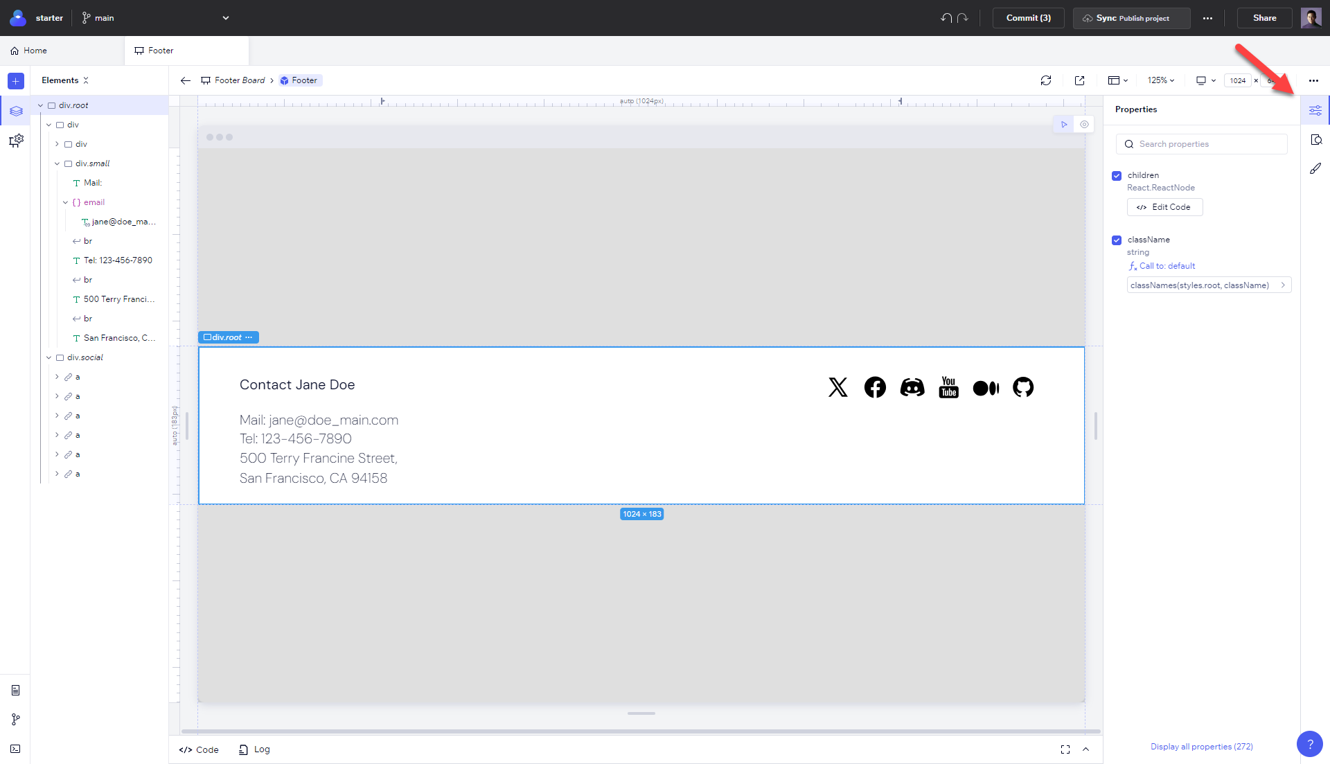
By default, Codux hides irrelevant properties, ensuring that the panel remains easy to navigate. When you open the panel, it displays properties marked as important in JSDoc, those with assigned values, interfaces from the same file as the component, and required properties.
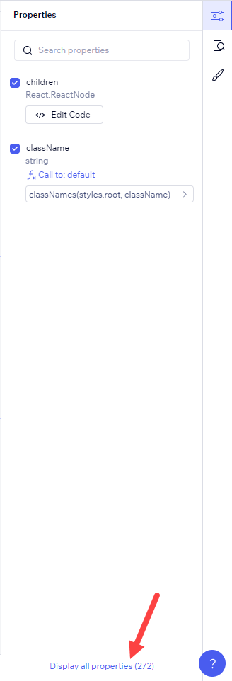
To view all properties, simply select Display all properties.
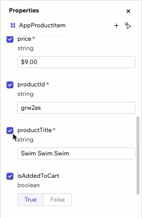
It's worth noting that some properties are optional, while others are not. Required properties have an asterisk beside them, and if you remove one of these from a board, you'll see error indicators beside it and those nested with it.
Inside the Panel
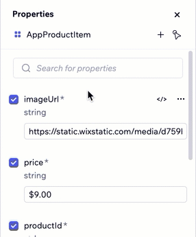
The Properties panel works by you first selecting an element from the Elements panel. Select one, and you'll see the panel populate with the element's properties.
When there are multiple properties to show, you'll see a search bar at the top of the panel. Use this bar to narrow down the properties of the selected element to those that you're interested in viewing.
Select View code to jump directly to the area of code in the code drawer where the property resides.
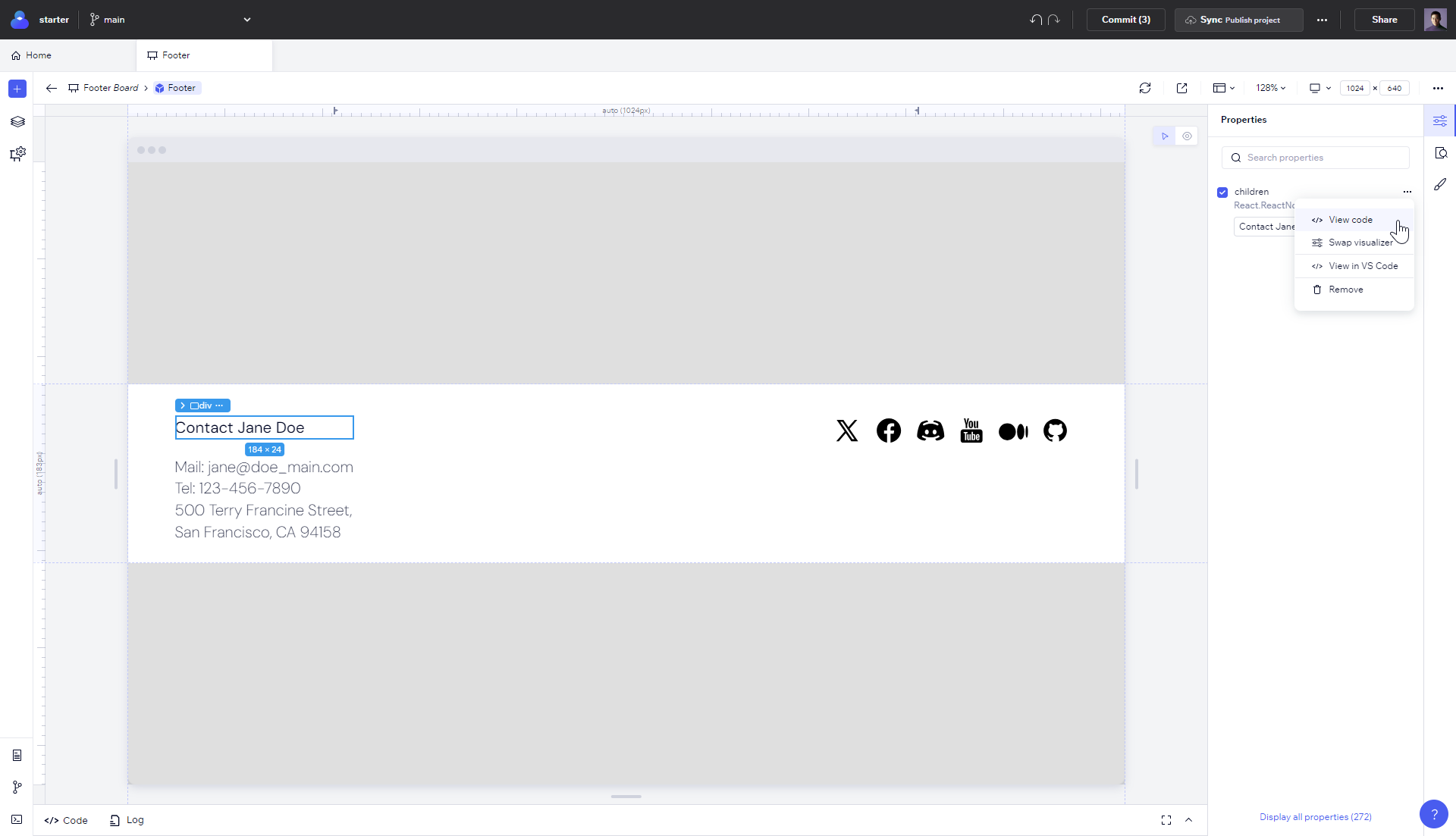
From the ellipsis menu, you'll also be able to remove the element's property from the rendering, swap input types with the swap visualizer option, and to open the file in VS Code.
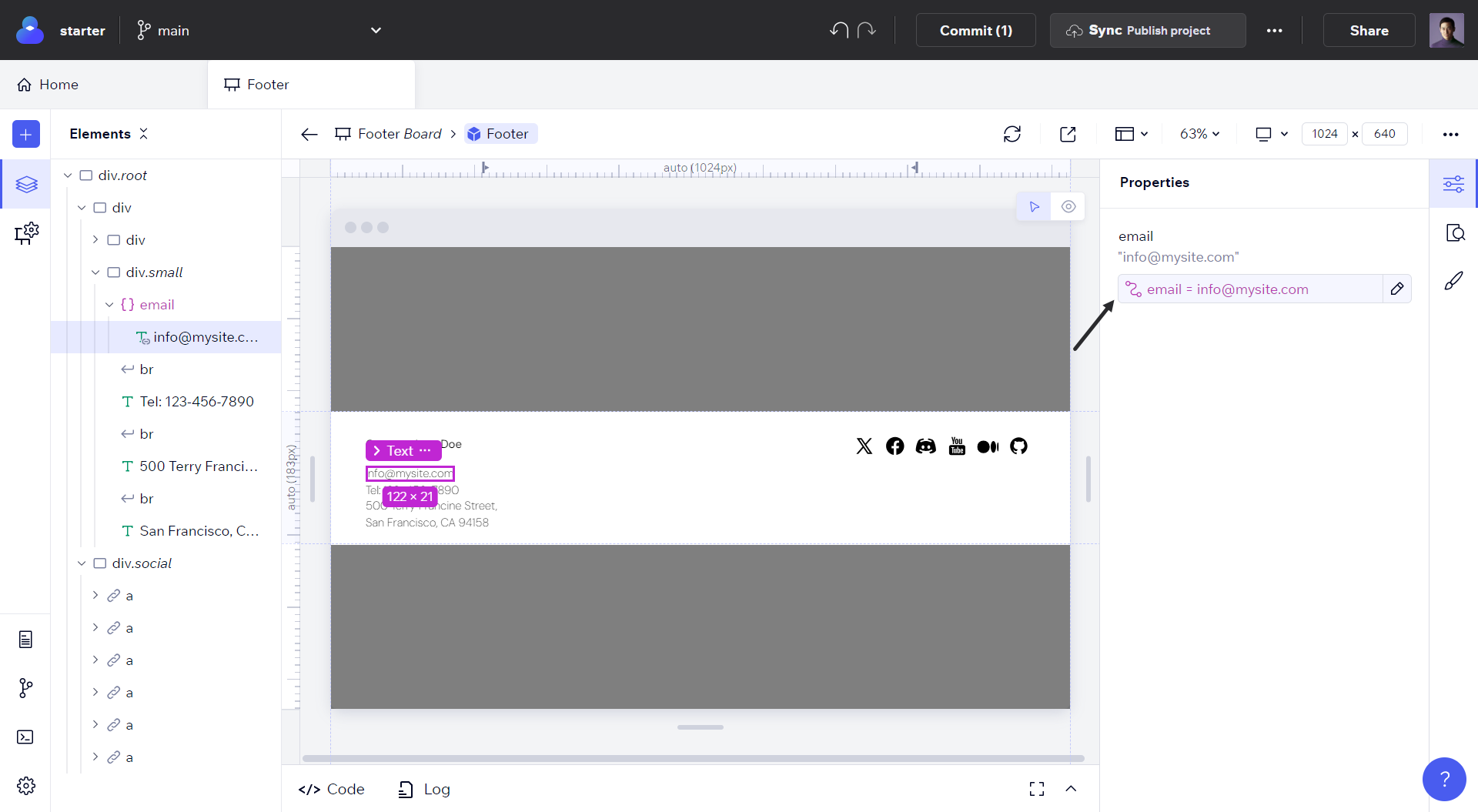
Connecting and Disconnecting Property Values
Codux shows property values associated with components right in the Properties panel. They can be dynamic values, calculations, or references to other variables. Here's how it looks:
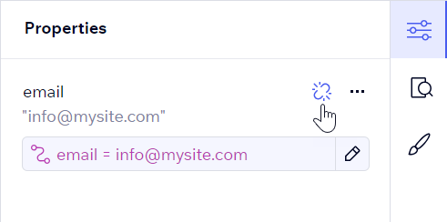
To disconnect a value from the property, select the disconnect button.
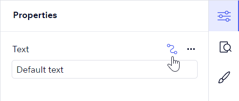
When Codux can determine the default values for the property, JSX text nodes will be replaced by "default text", and JSX expression nodes with actual default values (e.g.,
{myStringReference} becomes {'Default text'}). If the default value is unknown, Codux will replace it with "undefined".To connect a property, choose from the relevant
For selected JSX elements, Codux removes optional properties entirely and replaces non-optional property values with defaults.
Check out how easy it is to connect properties in your project:
Was this article helpful?