Codux Help Center
Browse our articles to find the answers you need
Style Properties
This article describes the style properties available through the Styles panel, including styling for an element's:
Layout
This section of the Styles panel provides various layout options for styling HTML elements.
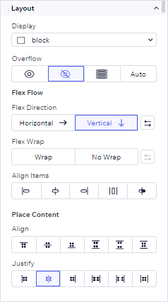
Display
Overflow
Flex Flow
Place Content
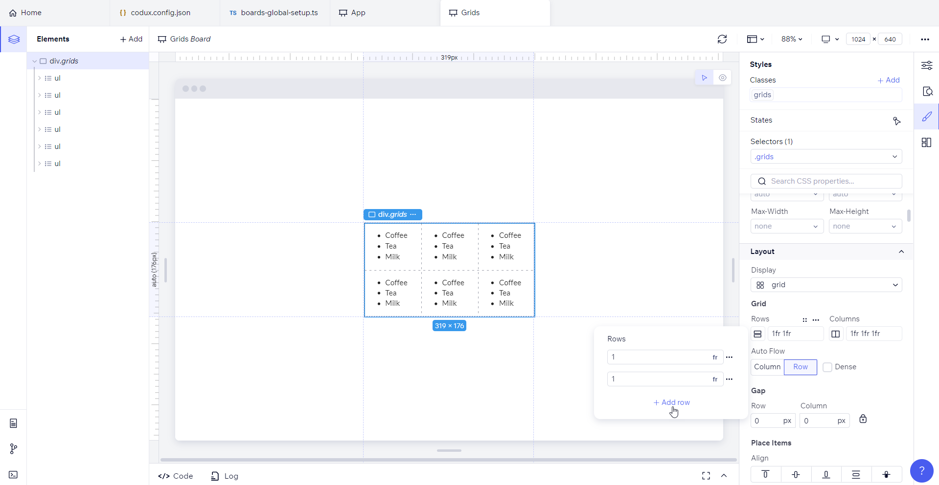
When you select a specific display option, relevant additional settings will become available. For instance, if you choose the grid display, you'll be presented with row and column settings. The on-stage grid representation feature provides a visual preview of your styled grid, including both cells and gaps, enhancing your understanding of the grid's appearance.
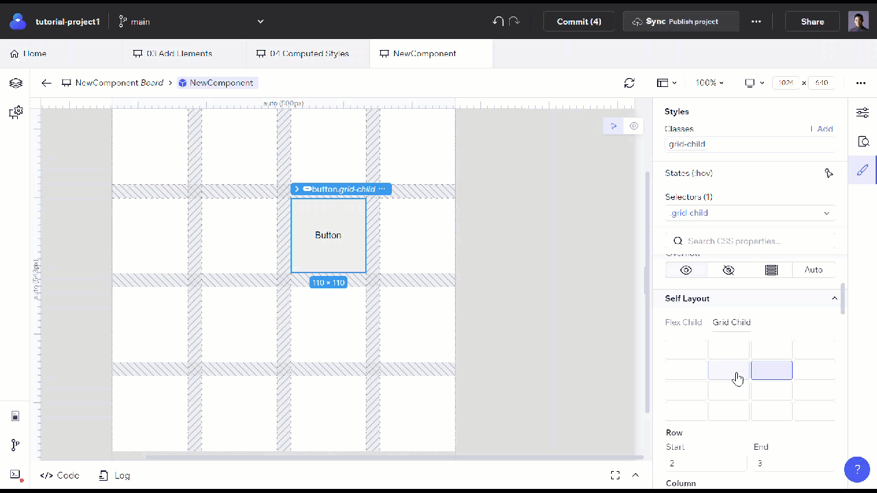
Self Layout
When you set a parent element's layout to flex or grid, you'll want to fine-tune how each child should sit inside the parent container. Otherwise, they'll take on the default properties from the parent.
Flex is a one-dimensional layout system, while grid is two-dimensional. Use the properties here to set the applicable arrangement of children.
Position
This property specifies the method to use for positioning the element.
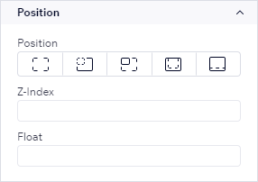
Positions can be static, relative, absolute, fixed, or sticky. You can also configure the element's z-index to specify its stack order and add a float value for it.
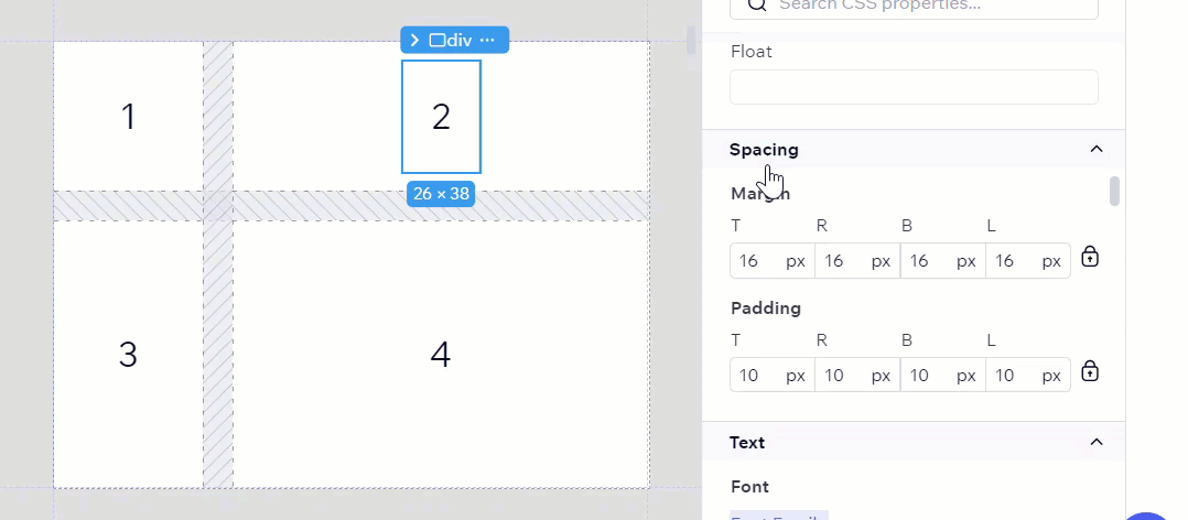
Spacing
The Spacing section contains visual controllers for modifying an element's margins and padding.
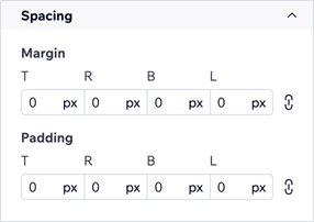
You can add margins and padding to the top, bottom, left, and right sides of an element, with the option of locking the margin and padding properties so that all four sides of the element share the same spacing. When you hover over margin and padding properties in the Styles panel, you'll see a preview of their effect on the stage.
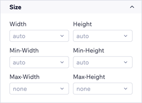
Size
The size property does exactly what it sounds like — it controls the size of the element, by way of controlling the element's width, height, min-width, min-height, max-width, and max-height.
Text
The text style controllers tailor a text element's font, color, alignment, direction, spacing, decoration, shadow, list style (if applicable), and more. By default, only the style's font options show up in the panel. To expose the text decoration and list style properties, select More properties.
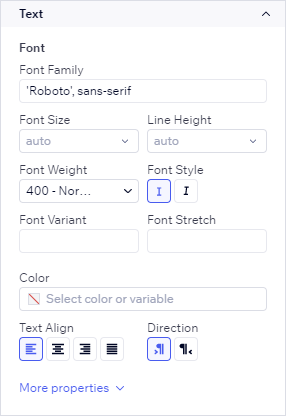
Refer to MDN Web Docs for more information on CSS fonts.
Borders and Corners
Similar to spacing, Borders & Corners properties provide a visual way to edit the borders, corners, and outline of an element.
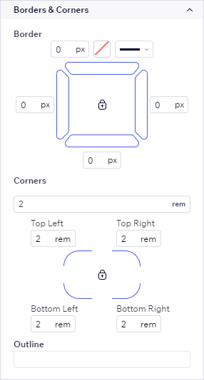
From here, add spacing to the top, bottom, left, and right sides of an element. The lock button ensures that all four sides of the element share the same spacing.
Backgrounds
The Backgrounds section contains controllers for filling the background color of your element.
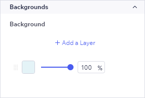
You may add a new background color layer using the button, or duplicate an existing one to then modify. Then, use the gradient slider to combine your colors to get the right mix.
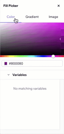
Inside the color fill picker are more advanced options for background gradients and image scaling.
Effects
You'll find a plethora of customization options for shadows by opening the shadow settings picker.
Others
The Others section catches all the styles from your component's code that don't fall into other categories. For example, if you look at the bottom of the image below, you can see that the CSS property transform in the component's CSS file is in this category and not in any of the ones above.
Note:
Codux indicates defined or overridden shorthand values through colors in the Styles panel. When the border, outline, and background visual controllers show blue, the value is defined, while orange indicates overridden. Greyed-out values you see in the Styles panel are not derived from your code. Codux shows you the values supplied by the User Agent, which in this context is the browser. These styles reflect the actual visual representation of the app's elements. They serve as the browser's default styles, also known as the User Agent Stylesheet rules, and are applied when no specific style has been defined in your code.
Was this article helpful?