Codux Help Center
Browse our articles to find the answers you need
Selectors
Note:
See here to read up about states.
One of the essential features of app development is the use of style selectors to customize the appearance of elements. A style selector is a code snippet that specifies how certain elements of an app should look or behave when rendered, and to modify the look of the app without having to write new code for each change. They don't change the structure of HTML, but how the content looks onscreen.
Codux lets you easily identify the selectors that affect the element you select on the board. For example, in the image below, you can see three selectors in the Styles panel that apply to the selected element.
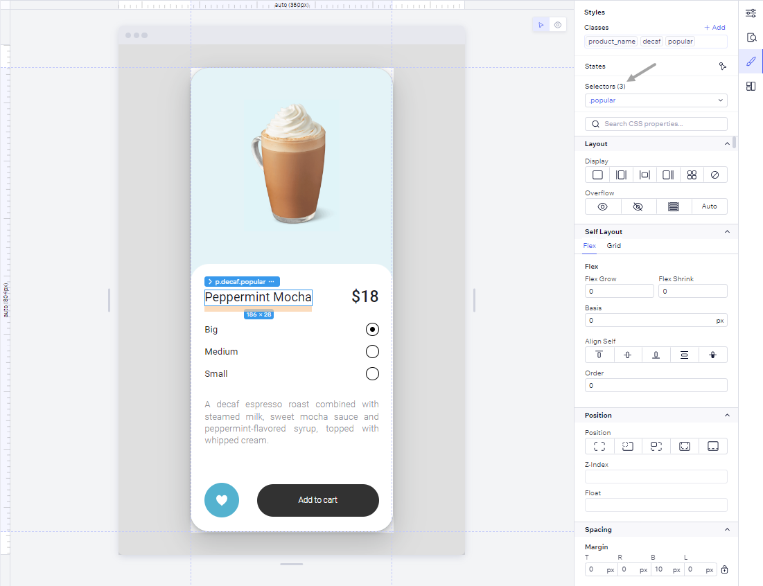
By default, Codux chooses the most relevant selector for you based on its specificity. This means that it picks the most specific selector from the current scope that is not global and therefore safe to modify. The most specific selector is always the first one in the list. If you pick a different selector, Codux will remember your choice and use it again when you select the same element.
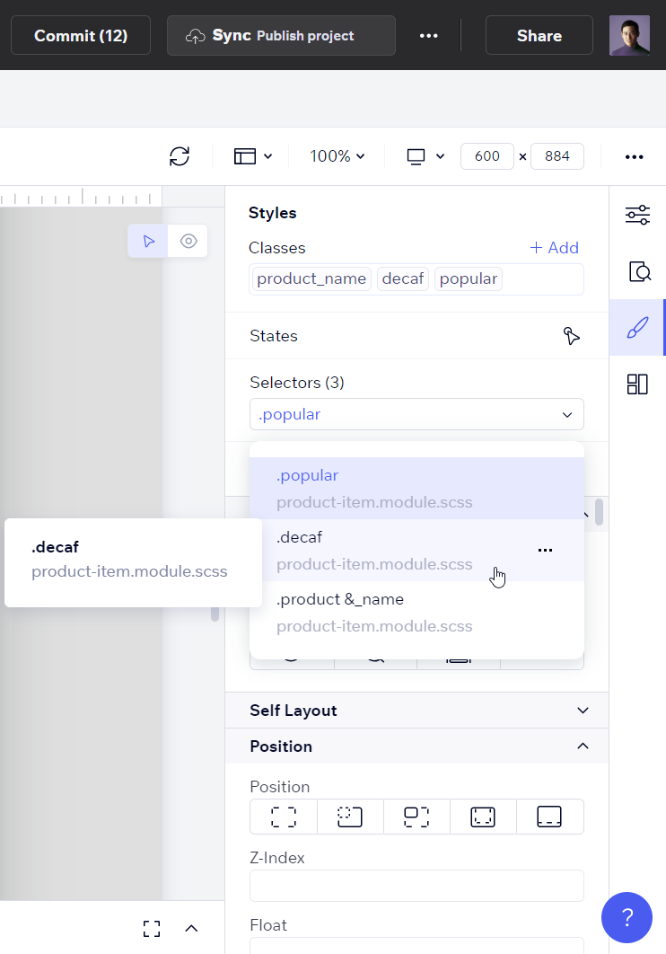
To preview the styles that a selector applies, you can hover over it and see a quick view of the selector. You can also see which file the selector comes from by looking at the file name below the selector name.
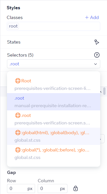
Codux also uses color codes to indicate the category of selectors. Global selectors, which are risky to change because they can affect any div in the component, are marked with an orange color and a globe icon.
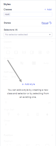
If you select an element state that does not have a style rule yet, Codux will show you a message and let you add a style right away.
When you change the state of an element, the selectors may change as well depending on their relevance.
Some selectors have an icon next to their name to show what kind of selector they are. For example, media query selectors with a screen icon only apply to the element when the user's screen size matches the media query. To manage responsive design, select and edit selectors directly on stage by switching between media queries using the indicators on the stage rulers.
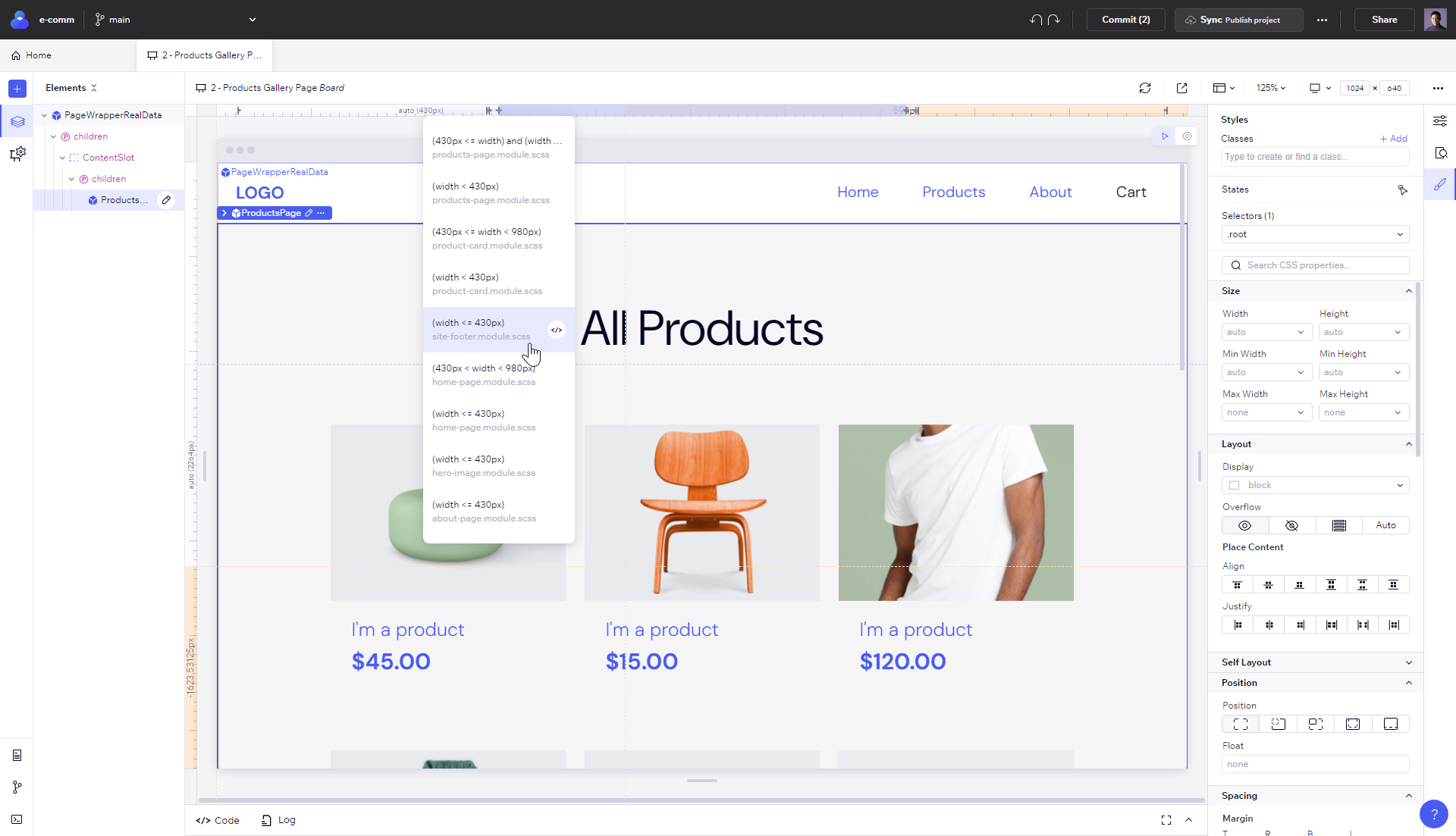
To add a new selector, create a new style class or edit the code.
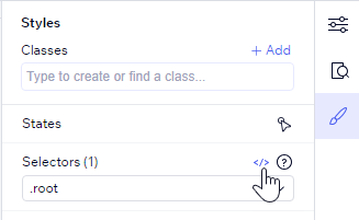
Here are some examples of media queries that you can also add in your project's code:
Basic Breakpoint: If the browser window is 600px or smaller, change the background color to light blue.
@media only screen and (max-width: 600px) {
body {
background-color: lightblue;
}
For Mobile: Design for mobile first by setting styles for smaller screens first, then adjust for larger screens:
/* For mobile phones: */
[class*="col-"] {
width: 100%;
@media only screen and (min-width: 768px) {
/* For desktop: */
.col-1 { width: 8.33%; }
/* ... other column widths ... */
.col-12 { width: 100%; }
For Tablets: Add a breakpoint for tablets (between 600px and 768px)
@media only screen and (min-width: 600px) {
/* For tablets: */
.col-s-1 { width: 8.33%; }
/* ... other column widths ... */
.col-s-12 { width: 100%; }
Tip!
To see where an element gets its style from, use Computed Styles on the right panel. It shows all the styles for the selected element, regardless of the class or selector they come from.
Important!
Codux lets you edit inline styles and create selectors for them. These are the most specific selectors, and they always appear at the top of the list. However, inline styles have limited support and some features like reference variables, connecting styles, etc. will not work.
Tip!
To use selector IDs with CSS Modules in React, import the CSS module and use the imported
styles object as id attributes in your JSX. This lets you style components statically or dynamically.Was this article helpful?